Aigens: All-inclusive Design System in hospitality

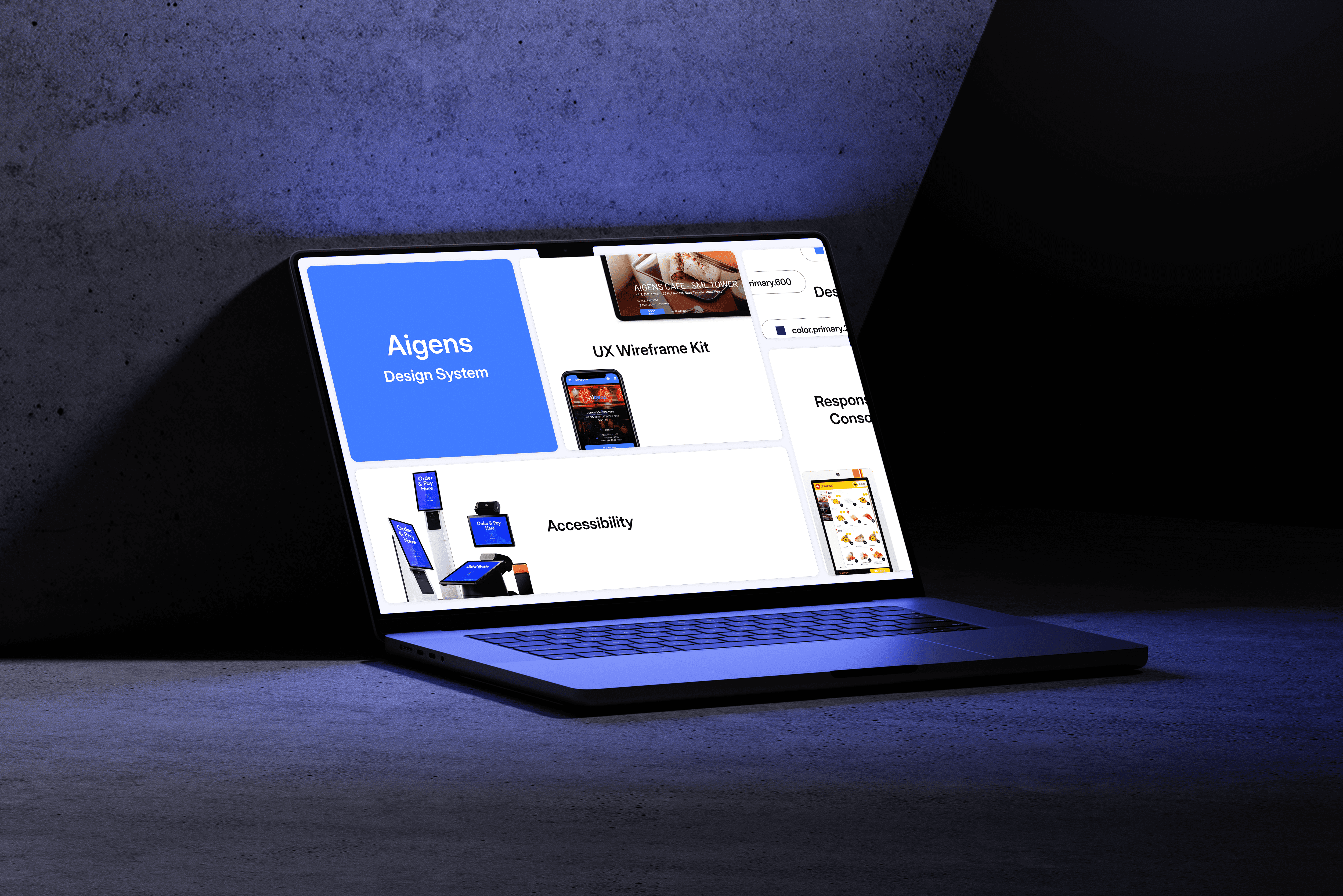
Aigens is a SaaS solutions company focus on the hospitality industry who serves wide range of product: loyalty program, Middleware (POS), ordering and delivering.

Overview

From the a single component to guideline, the design system aims to provide an unified, reusable and standardized guideline to accelerate the collaboration in between designers and developers.

From the a single component to guideline, the design system aims to provide an unified, reusable and standardized guideline to accelerate the collaboration in between designers and developers.

I served as the UXUI lead that developed, established and monitored the multi-purposes design system for Aigens. From end to end, my responsibilities ranged from crafting components, developing design token to establish design guidelines. I created not only a systematic guide book, but also guarantee the consistency and accessibility in user experience.

Role

UXUI Lead

Duty

Establish Design System

UI Design

Design Token

Tool

Figma

FigJam

Github

Team

UXUI Lead (me)

UI Designers*2

Developers*3

Product Director

Structural Improvement
Collaboration
Collaboration
Scalability
Multi-purpose
Multi-purpose
Accessibility
Accessibility

Improve Structural Issue: Figma files with multiple guidelines

Improve Structural Issue: Figma files with multiple guidelines

Improve Structural Issue: Figma files with multiple guidelines

Since Aigens serves several key accounts and their brands, our team manages multiple Figma files containing corresponding components. As a result, there are many repetitive designs and unclear guidelines. This has led to inconsistencies in our work and negatively impacted collaboration within the team.

To fix it fundamentally, we took the approach to unify the files and elements by brands, and hosted design system workshop for other departments.

Since Aigens serves several key accounts and their brands, our team manages multiple Figma files containing corresponding components. As a result, there are many repetitive designs and unclear guidelines. This has led to inconsistencies in our work and negatively impacted collaboration within the team.

To fix it fundamentally, we took the approach to unify the files and elements by brands, and hosted design system workshop for other departments.

BEFORE

0
0

Files that stores components

0
0

Different styles of branding

AFTER

0
0

Design Systems*

0
0

Styles are unified

*3 Different design systems are for various products: Mobile ordering (End user), Universal App (Hospitality management for staffs)

Accelerate Collaboration between Various Teams

Accelerate Collaboration between Various Teams

Accelerate Collaboration between Various Teams

PRODUCT BI-WEEKLY

WEEKLY SYNC UP

CLEAR DOCUMENTATION

FUNCTIONAL DEMO

I hold weekly sync-up meetings within design team to brainstorm ideas and report on the progress. Also I have initiated bi-weekly sync-up for the product team (developers, designers and product managers included) to align everyone on the design system, including recent updates and areas for improvement.

For other departments, such as the enablement team and sales & marketing team, I hosted a functional demo to showcase how they could utilize elements from the design system in their tasks, to help departments adopt a unified language.

Additionally, I have organized, centralized and refined the documentation in Figma to improve communication among team members and stakeholders.


Scalability on Feedback Flow

Scalability on Feedback Flow

An efficient design system must have its ability on scaling. I established a feedback flow that allows stakeholders to submit requests and suggest changes to the design system as needed.

Multi-purpose template library

Multi-purpose template library

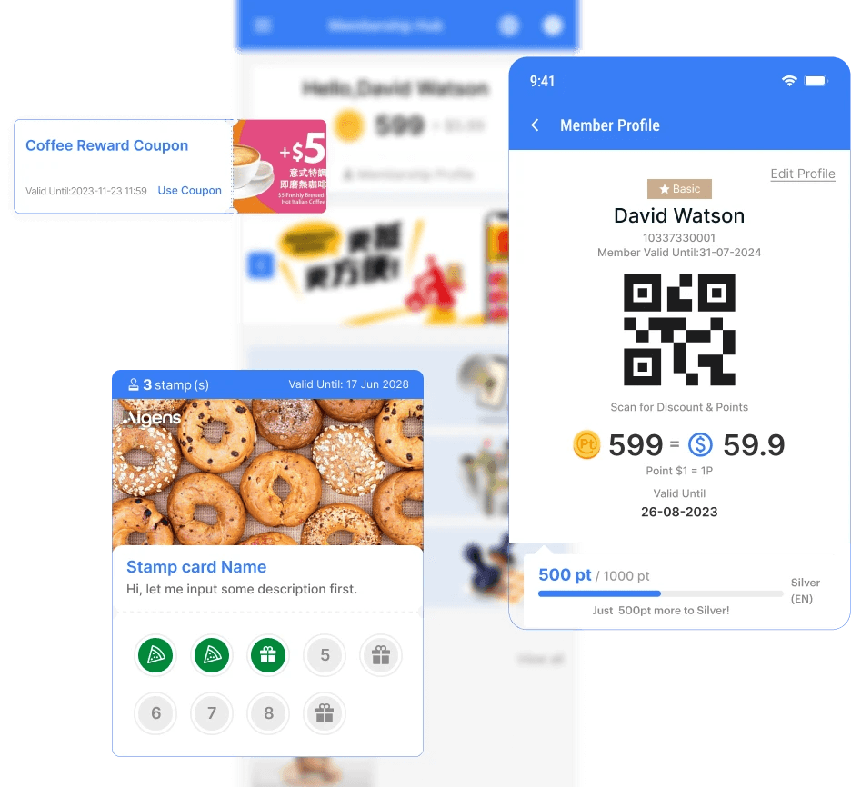
The Aigens design system offers clear guidelines for the team and functions as a template library, featuring a UX wireframe kit and a loyalty program framework. They are set up to enhance teamwork and acclerate rapid development.

Additionally, the loyalty program framework also function as a prototype for demo when pitching to customers.

UX Wireframe Kit
Loyalty Program Framework
Accessibility

Accessibility

Accessibility

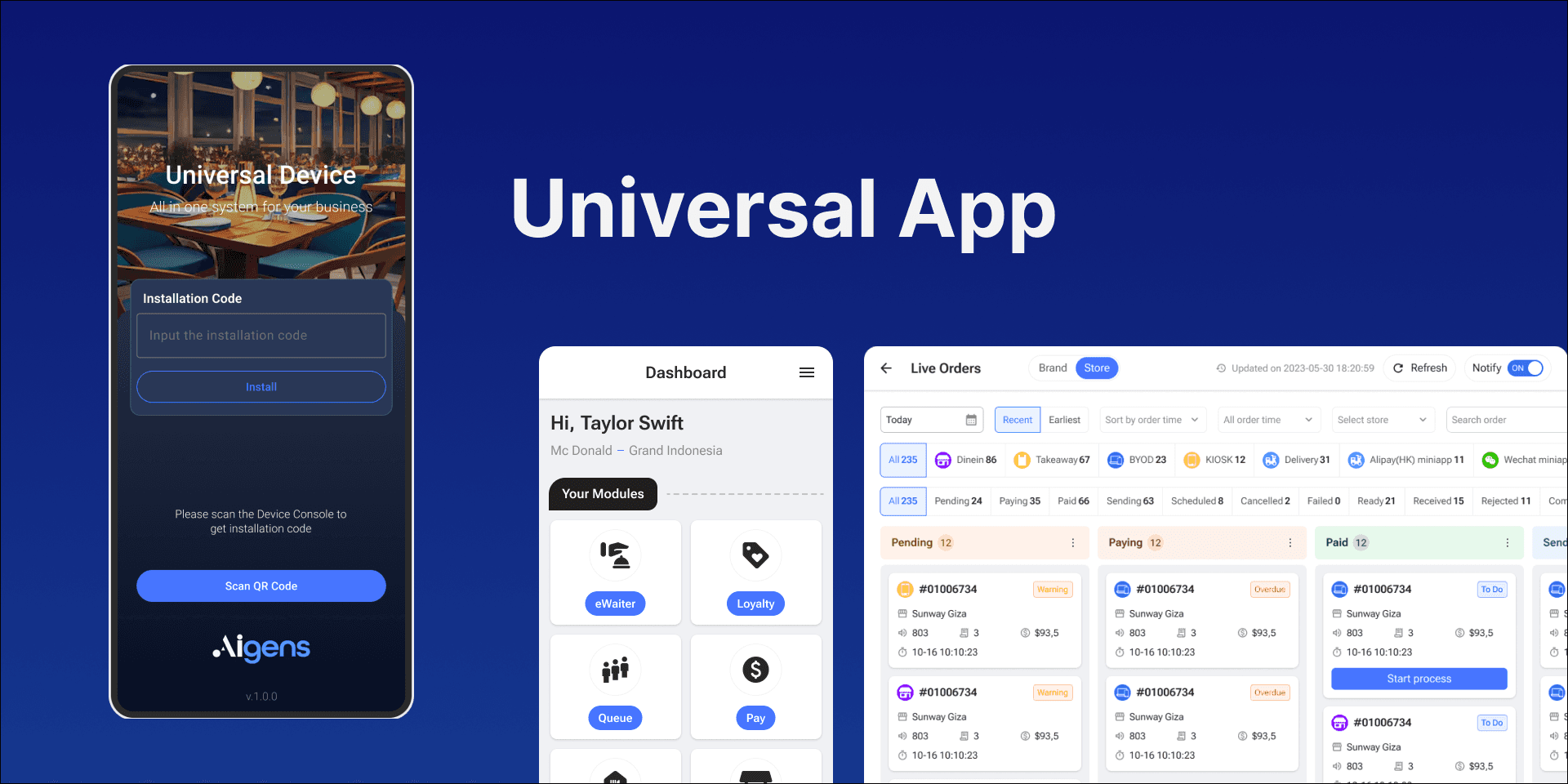
Hospitality POS product is all-inclusive to wide range of users, including elders, children or people with visual or limb disabilities. Considering that users access the system through various devices such as mobile phones, consoles, tablets, and kiosk machine, I crafted responsive, accessible components for the Aigens design system product suite.

The accessibility standard revolves around 5 main principles, which are: universal, all-inclusive, optimized, detailed and standardization.

Universal - Responsive to mobile, tablet, desktop, kiosk, console
All-inclusive
Optimized
Detailed
Standardization

Design Token
I established the design token structure with developers to deliver a scalable and consistent visual system for UI development while systematically managing visual design attributes. With the design token, it enhances efficiency of component development.

I established the design token structure with developers to deliver a scalable and consistent visual system for UI development while systematically managing visual design attributes. With the design token, it enhances efficiency of component development.

Structure Breakdown
Structure Breakdown

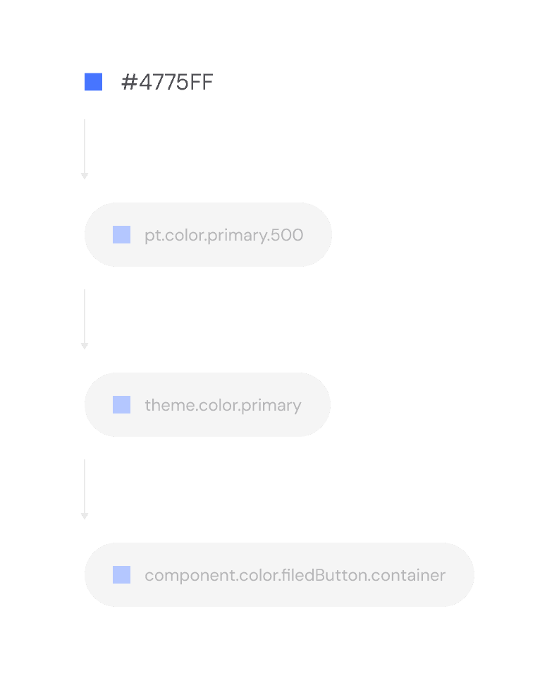
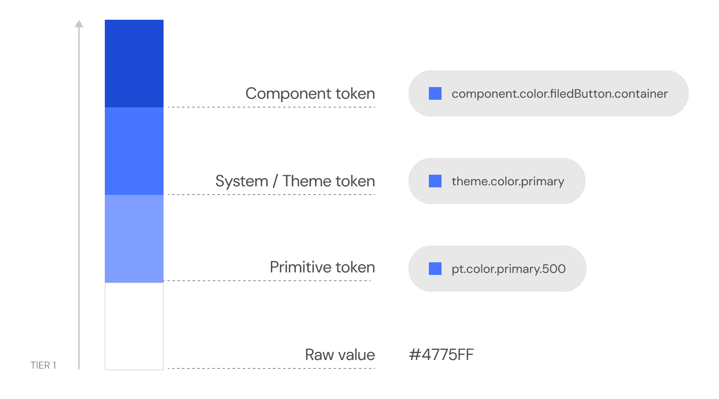
The design token structure consists of four layers: raw value, primitive token, system or theme token, and component token. Each higher-tier token contains more specific design information.

The design token structure consists of four layers: raw value, primitive token, system or theme token, and component token. Each higher-tier token contains more specific design information.

Raw Value
Raw Value

I have defined all the fundamental values of color codes, dimensions or direct reference to another token.

I have defined all the fundamental values of color codes, dimensions or direct reference to another token.

Primitive tokens
Primitive tokens

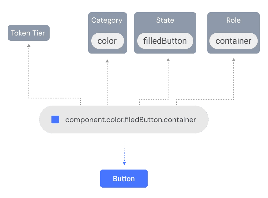
Primitive tokens are constructed from several elements: category, variant, and sub-variant. Our team have systematized the design language for specific themes or contexts.

Primitive tokens are constructed from several elements: category, variant, and sub-variant. Our team have systematized the design language for specific themes or contexts.

Primitive tokens are constructed from several elements: category, variant, and sub-variant. Our team have systematized the design language for specific themes or contexts.

System / Theme token

System or theme tokens are used to create aliases for global tokens so that they can be reused across multiple components.

System or theme tokens are used to create aliases for global tokens so that they can be reused across multiple components.

System or theme tokens are used to create aliases for global tokens so that they can be reused across multiple components.

Component token
Component token

Component token points to the specific component

Component token points to the specific component

Create a free website with Framer, the website builder loved by startups, designers and agencies.